Your cart is currently empty!
QUICKY RESCUE & RECOVERY

Written by
in
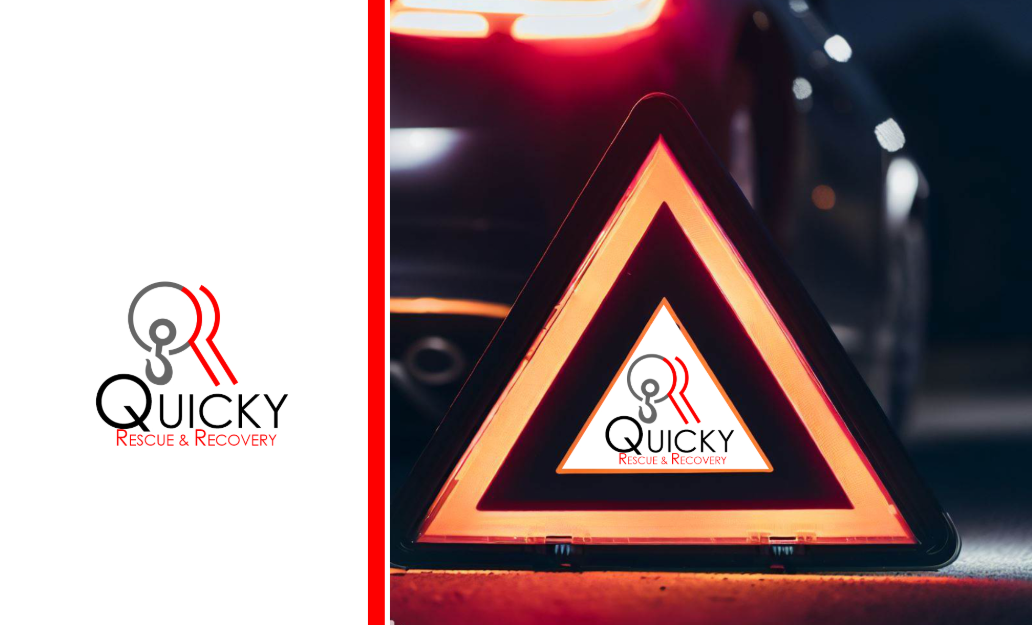
Quicky Rescue and Recovery – QRR – offers auto recovery services and road side assistance. They help people in distress and so they boast of two key things: a quick response and the capacity to help. They replace the red/reflective warning triangle in a short space of time. They wanted a smooth modern look since they wanted to emphasize how accessible they are with modern tech. UPWORK
Design Script: QUICKY RESCUE & RECOVERY
Concept:
To create a logo that embodies speed, strength, and reliability, reflecting the company’s core values of rapid response and effective rescue and recovery services.
Elements:
- Logomark:
- A stylized “QRR” formed by:
- A hook-like shape extending from the circle, resembling a tow hook and subtly forming a “Q” for “Quicky”, signifying the company’s swift action.
- Two parallel red lines forming the leg of the “R”, representing the road and the company’s commitment to getting clients back on track. The varying thickness of the lines adds a dynamic element, suggesting motion and progress.
- The negative space within the hook cleverly forms another “R”, emphasizing the “Recovery” aspect of the service.
- A stylized “QRR” formed by:
- Logotype:
- “QUICKY” in a bold, impactful font with rounded edges, conveying speed and efficiency.
- “RESCUE & RECOVERY” in a clear, legible font beneath, directly communicating the company’s services.
Color Palette:
- Black: Represents strength, authority, and sophistication. Used for the “QUICKY” text and the outline of the logomark, giving it a strong presence.
- Red: Symbolizes urgency, action, and attention. Used for the “RESCUE & RECOVERY” text and the road-like element in the logomark, highlighting the company’s responsive nature.
- Grey: Represents stability, reliability, and professionalism. Used for the wheel element in the logomark, suggesting the dependable nature of the company’s services.
- White: Represents purity, clarity, and simplicity. Used as the background color, ensuring the logo stands out and is easily legible.
Typography:
- QUICKY: A bold, sans-serif font with slightly rounded edges, conveying a sense of speed and efficiency.
- RESCUE & RECOVERY: A clean and legible sans-serif font, ensuring clarity and readability.
Overall Impression:
The logo conveys a sense of quick response, reliable service, and effective recovery. The dynamic “R” symbol with its hidden “Q” and double “R” adds a layer of visual interest and reinforces the company’s name and services. The color palette and typography work together to create a strong and memorable brand identity.
Applications:
The logo can be applied across various mediums, including vehicle livery, signage, uniforms, website, and marketing materials. Its bold design and clear messaging will ensure it stands out and effectively communicates the company’s brand identity.
Additional Considerations:
- Reflective Materials: The logo can be enhanced using reflective materials for added visibility and safety. The grey circle and hook can be made of reflective silver material, while the red lines can be outlined with red reflectors. The black outline can be left as is or outlined with white reflectors for contrast.
- White Background: The white background is essential for maintaining the logo’s clarity and legibility, especially when applied to various surfaces and in different lighting conditions.
Discover more from <enTA
Subscribe to get the latest posts sent to your email.
Leave a Reply